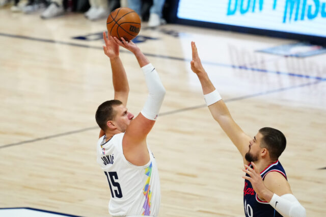
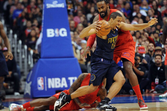
The Denver Nuggets officially unveiled their Nike “City” Edition uniforms tonight. This is the fourth and final jersey unveiling. Of course Conrad Burry of Sportslogos.net had already provided lots of insight on what the City Edition would look like. He correctly called the dominant navy color, golden pickaxe logo and number color scheme. However, the jerseys feature a larger logo than in Burry’s mock up and also have a small sidepanel that features sky blue and yellow.
Of course the obvious major thing that jumps out about these jerseys is the shorts. Multiple thin horizontal lines create a mountain landscape that is noticeable and unique. It certainly has the feeling of the type of choice that fans either love or hate, there is not way to just be so-so on these ones. Personally, I like the color scheme and I think its cool that Nike at least took a risk on one of the jerseys. I’m still a little unsure on the shorts to be honest. Like I said, it’s a bold choice so at least there’s that. Everything else we’ve seen thus far has really just been a rehash of last year’s jerseys with a few minor changes to design or color scheme. This jersey is a unique design all to itself and also to the league.
This content is no longer available.


